Every day in the stock market, buyers and sellers engage in an invisible tug of war. The price you see on your screen is simply the current score—but it doesn't tell you who's winning or how hard each side is pulling.
That's where the Average Directional Index (ADX) comes in. It's one of the most powerful tools for understanding not just where a stock is going, but how strongly it's moving in that direction.
The Engineer Who Changed Technical Analysis
The ADX was developed by J. Welles Wilder Jr., a mechanical engineer who turned his analytical mind to the stock market in the 1970s. His 1978 book, New Concepts in Technical Trading Systems, introduced not just the ADX, but an entire toolkit that traders still rely on nearly 50 years later:
- RSI (Relative Strength Index)
- ATR (Average True Range)
- Parabolic SAR
- ADX and the Directional Movement System
Wilder approached markets like an engineer approaches a machine—looking for measurable, repeatable patterns. The principles he derived remain foundational to modern technical analysis, and we owe much of how we understand momentum and trend to his work.
What the ADX Actually Measures
Unlike most indicators that try to predict price direction, the ADX measures something different: trend strength.
Think of it this way:
- A stock can be going up weakly or strongly
- A stock can be going down weakly or strongly
- A stock can be moving sideways with no trend at all
The ADX tells you how much directional movement exists—regardless of whether that direction is up or down.
The Three Lines Explained
The ADX system consists of three lines that work together. Let's break them down using this Tesla (TSLA) chart from StockIceberg:
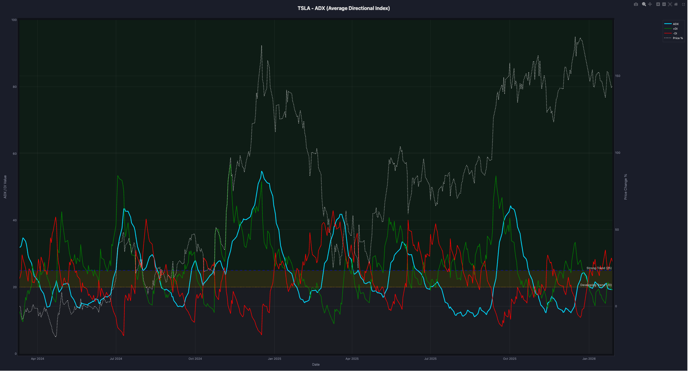
The Green Line: +DI (Positive Directional Indicator)
The +DI measures buying pressure—the strength of upward price movement. When buyers are aggressively pushing prices higher, +DI rises.
Think of it as measuring how hard the bulls are pulling their end of the rope.
The Red Line: -DI (Negative Directional Indicator)
The -DI measures selling pressure—the strength of downward price movement. When sellers are driving prices lower, -DI rises.
This represents how hard the bears are pulling on their side.
The Cyan Line: ADX (Average Directional Index)
The ADX itself doesn't care about direction—it measures the total intensity of the tug of war. Whether buyers or sellers are winning, the ADX tells you how decisive that victory is.
- ADX rising: The trend (whichever direction) is strengthening
- ADX falling: The trend is weakening, regardless of price direction
- ADX flat and low: No clear trend—the market is choppy
The Dotted White Line: Price
The price line (shown as percentage change) provides context. It helps you see how the ADX readings correlate with actual price movements.
Reading the Key Levels
Notice the horizontal zones on the chart:
| ADX Level | Interpretation |
|---|---|
| Below 20 | Weak or no trend—choppy, sideways market |
| 20-25 | Developing trend—momentum building |
| Above 25 | Strong trend—clear directional movement |
| Above 40 | Very strong trend—powerful momentum |
| Above 50 | Extremely strong—often seen in major moves |
The Tug of War in Action
Let's walk through what the Tesla chart reveals:
Late 2024: The Bulls Take Control
Look at the period around November-December 2024. Notice how:
- The green +DI line surges above the red -DI line—buyers are pulling harder
- The cyan ADX line rises sharply above 40—this isn't just buyers winning, they're winning decisively
- The price (dotted line) climbs dramatically—from roughly 75% to nearly 200% on the relative scale
This is what a powerful bullish trend looks like in ADX terms. The bulls aren't just ahead—they're dominating the tug of war.
Early 2025: The Rope Goes Slack
After the peak, observe what happens:
- ADX declines from its highs even as price remains elevated
- +DI and -DI converge—neither side has clear dominance
- The trend is exhausting itself, even before price shows significant weakness
This is the ADX's superpower: it often signals trend exhaustion before price reverses.
Mid-2025 Onwards: Choppy Waters
Through much of mid-2025, you can see:
- ADX hovering around or below 25—no strong trend
- +DI and -DI crossing back and forth—control changing hands frequently
- Price moving but without sustained direction
This is a ranging, choppy market—exactly when trend-following strategies struggle and the ADX warns you to be cautious.
How to Use ADX in Your Trading
Signal 1: The Crossover
When +DI crosses above -DI, buyers are taking control—potential bullish signal.
When -DI crosses above +DI, sellers are taking control—potential bearish signal.
But here's the key: These crossovers are more meaningful when ADX is also rising above 25. A crossover during a weak ADX environment often leads to false signals.
Signal 2: Trend Strength Confirmation
Before entering a trade based on other indicators, check the ADX:
- ADX > 25 and rising: Your trend-following strategy has a tailwind
- ADX < 20: Consider range-trading strategies instead, or stay on the sidelines
Signal 3: Trend Exhaustion Warning
When ADX has been high (above 40) and starts declining—even if price is still moving in the trend direction—the trend may be losing steam. This is often a signal to:
- Tighten stop-losses
- Take partial profits
- Avoid adding to positions
Common Mistakes to Avoid
Mistake 1: Treating ADX as a Directional Signal
ADX rising doesn't mean "buy." It means the current trend (up OR down) is strong. Always check +DI vs -DI for direction.
Mistake 2: Ignoring Low ADX Readings
A low ADX isn't "bad"—it's information. It tells you this is a ranging market where breakout strategies work better than trend-following.
Mistake 3: Acting on Every Crossover
+DI/-DI crossovers happen frequently. Filter them by requiring ADX confirmation (rising and above 20-25) before acting.
ADX Settings
The standard ADX uses a 14-period calculation, which Wilder recommended. This works well for:
- Daily charts for swing trading
- 4-hour charts for shorter-term positions
Some traders adjust to:
- 7-period: More sensitive, more signals, more noise
- 21-period: Smoother, slower, fewer false signals
Combining ADX with Other Indicators
The ADX works best as part of a broader analysis:
- ADX + RSI: Use RSI for overbought/oversold when ADX shows weak trend; use ADX for trend confirmation when RSI gives signals
- ADX + Moving Averages: Confirm trend direction with MAs, strength with ADX
- ADX + Volume: Strong trends should have supporting volume
Key Takeaways
- ADX measures trend strength, not direction—check +DI/-DI for direction
- Think of +DI and -DI as measuring the intensity of the tug of war between buyers and sellers
- ADX above 25 suggests a tradeable trend; below 20 suggests ranging conditions
- Watch for divergences between ADX and price—falling ADX during strong price moves warns of exhaustion
- The indicator was created by J. Welles Wilder Jr. in the 1970s and remains fundamental to technical analysis
- Combine with other tools—no single indicator tells the complete story
See It In Action
The ADX chart above is from StockIceberg's Single Stock Analysis section, where you can analyze any stock with this and 30+ other technical indicators. Understanding trend strength through tools like ADX helps you avoid fighting the market—and know when to step aside entirely.
Remember: Technical indicators are tools for analysis, not crystal balls. Always consider multiple factors and manage your risk appropriately.